For Wildlife. For All.
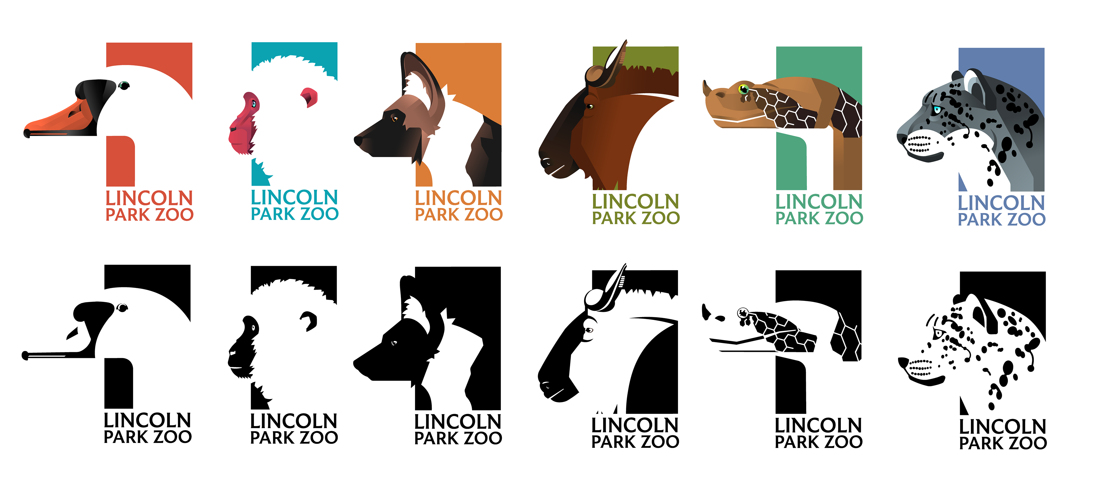
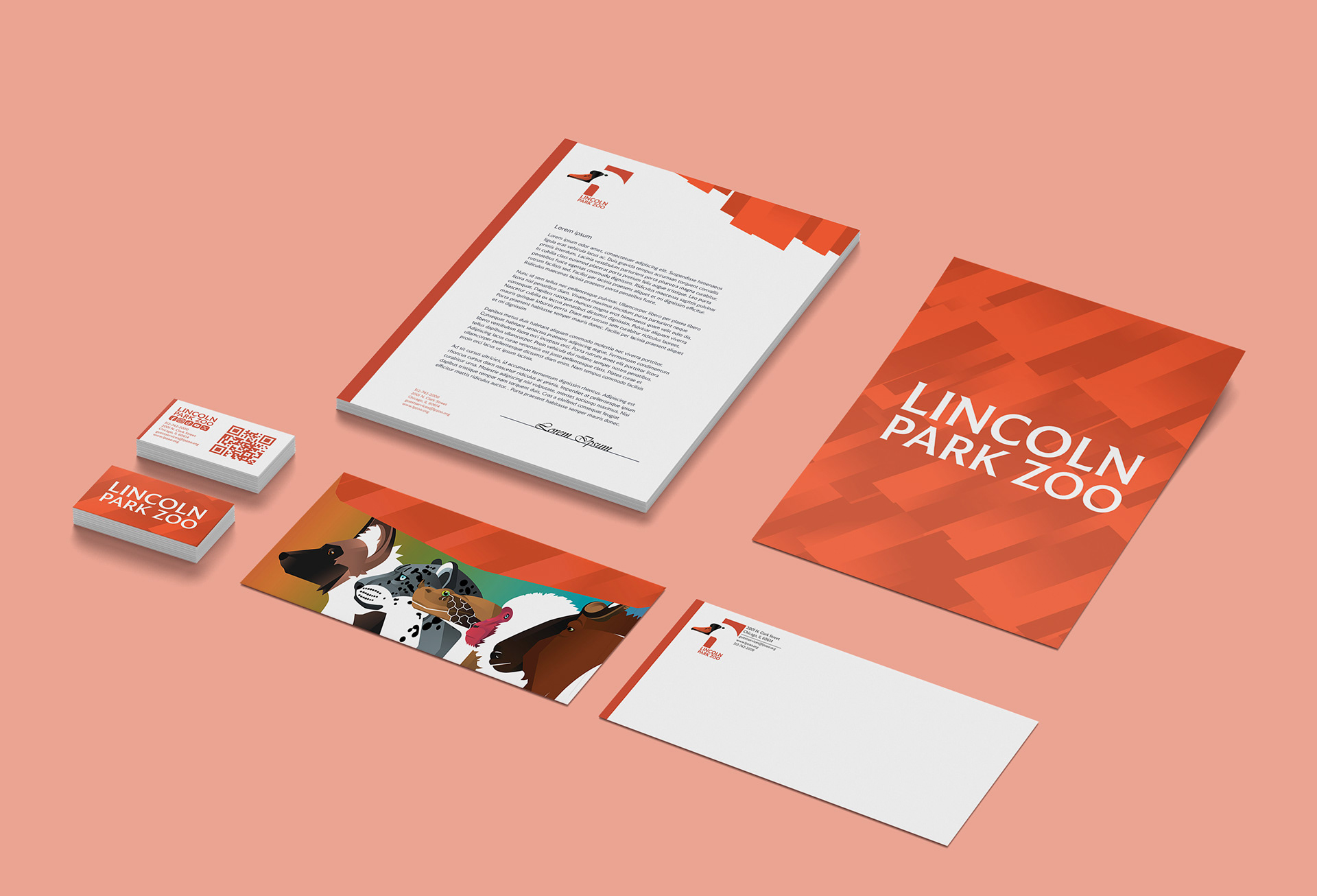
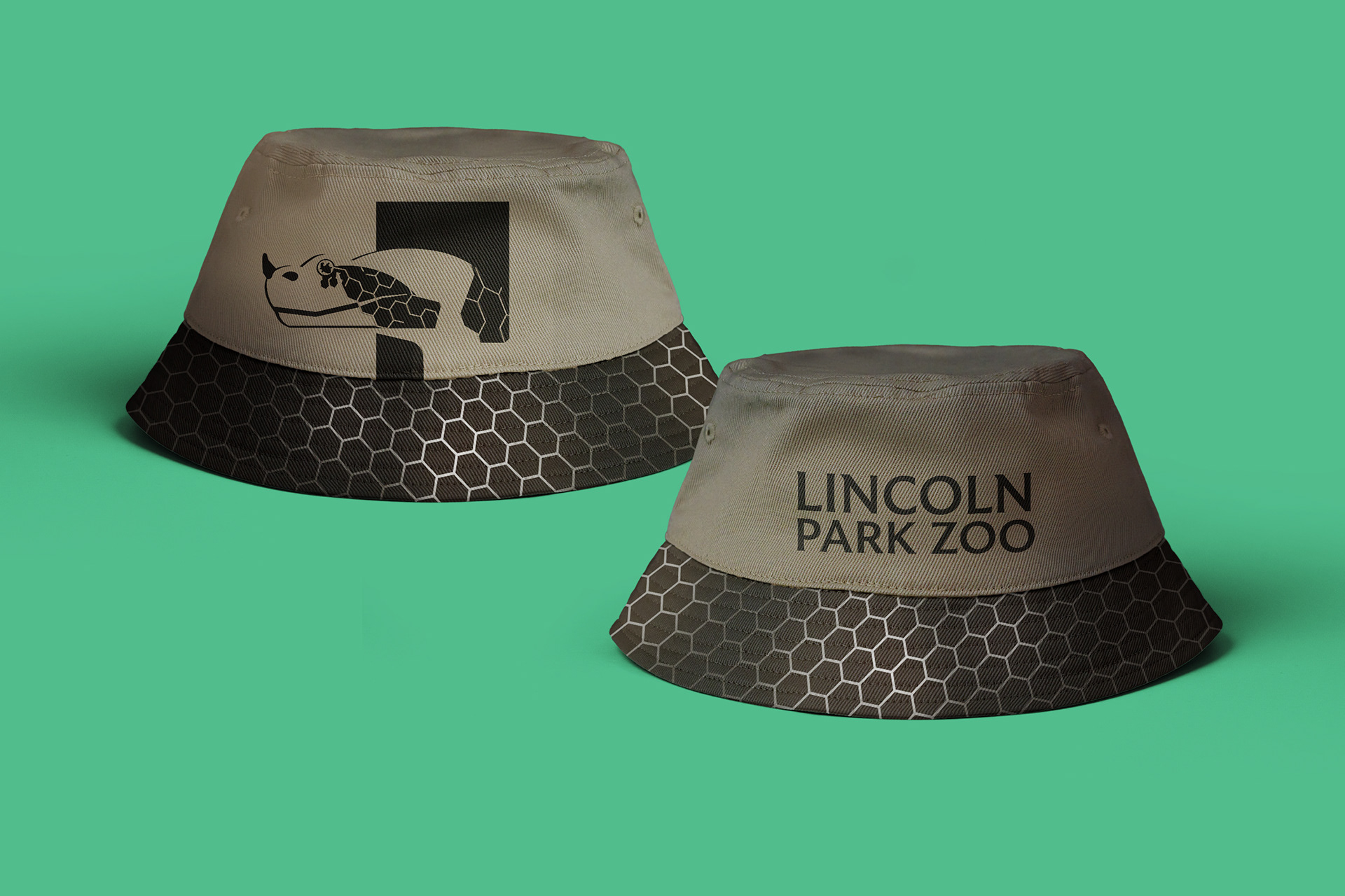
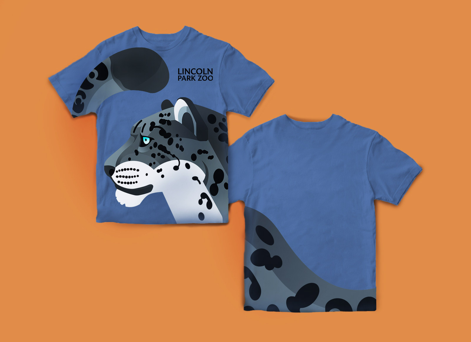
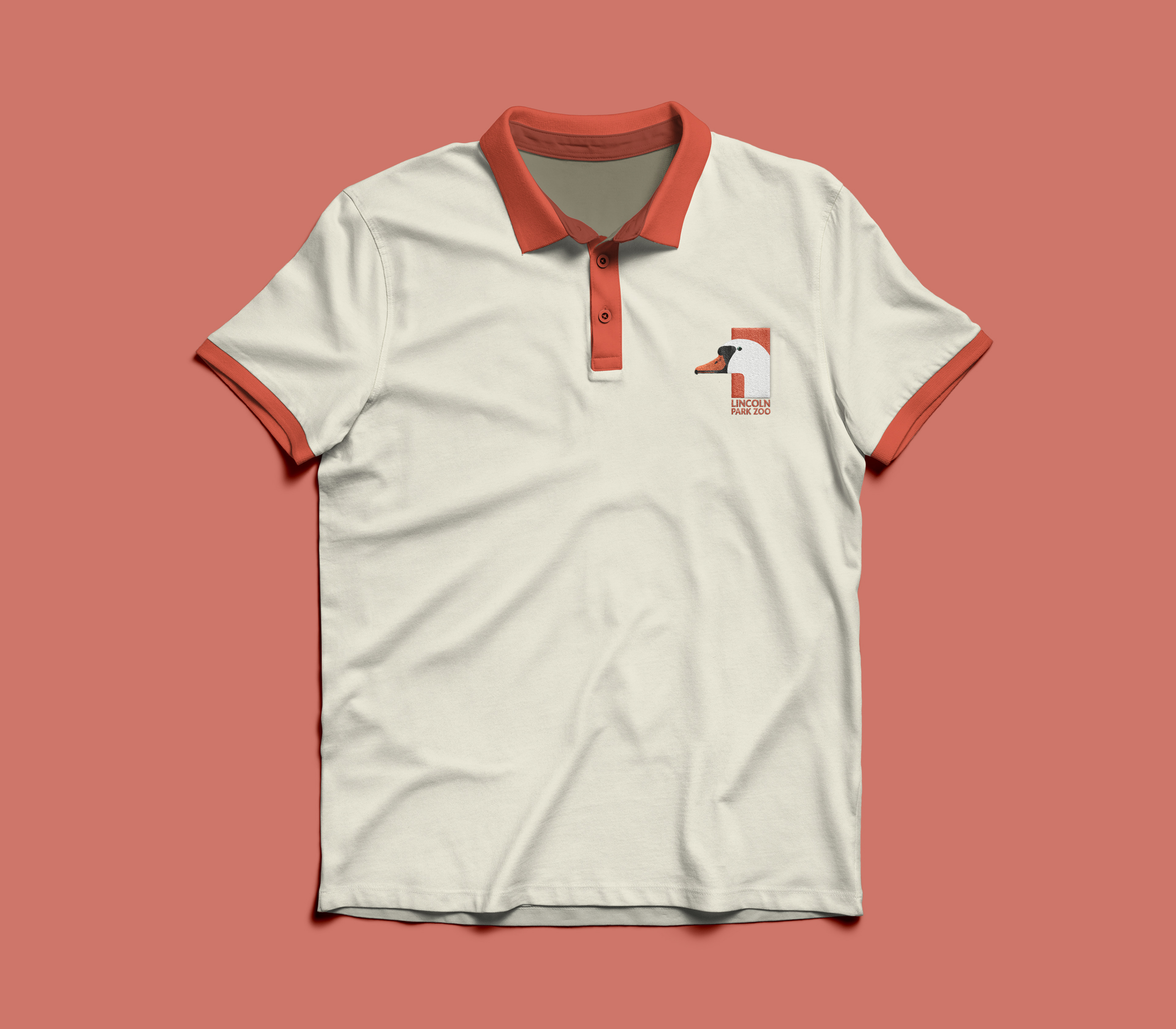
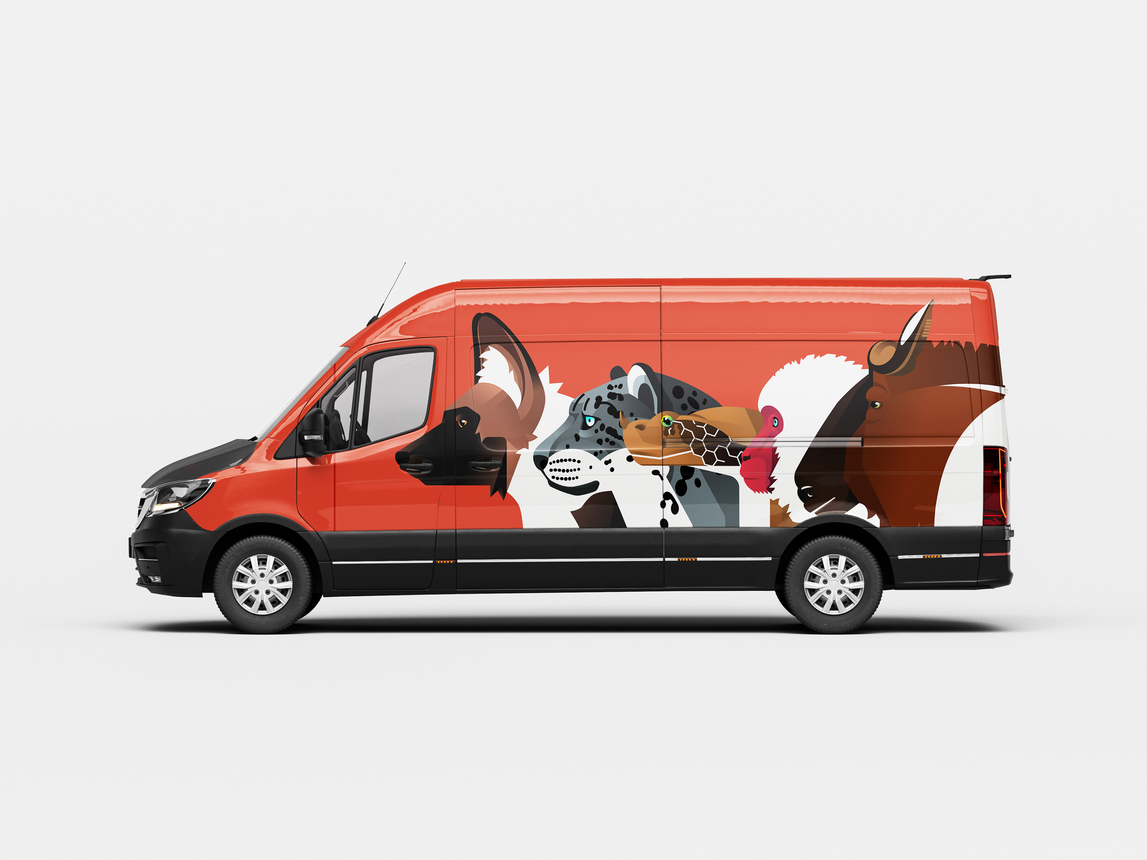
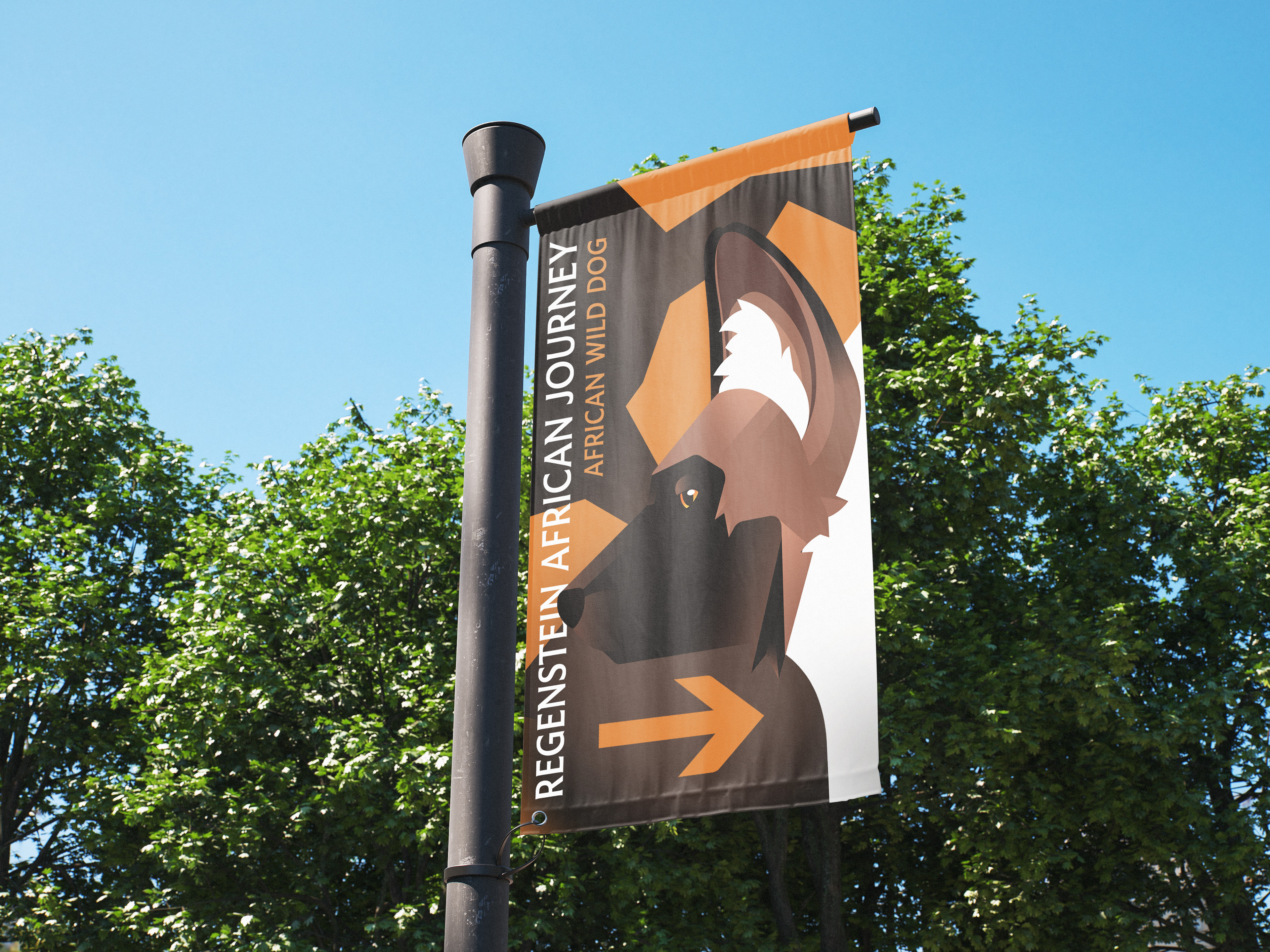
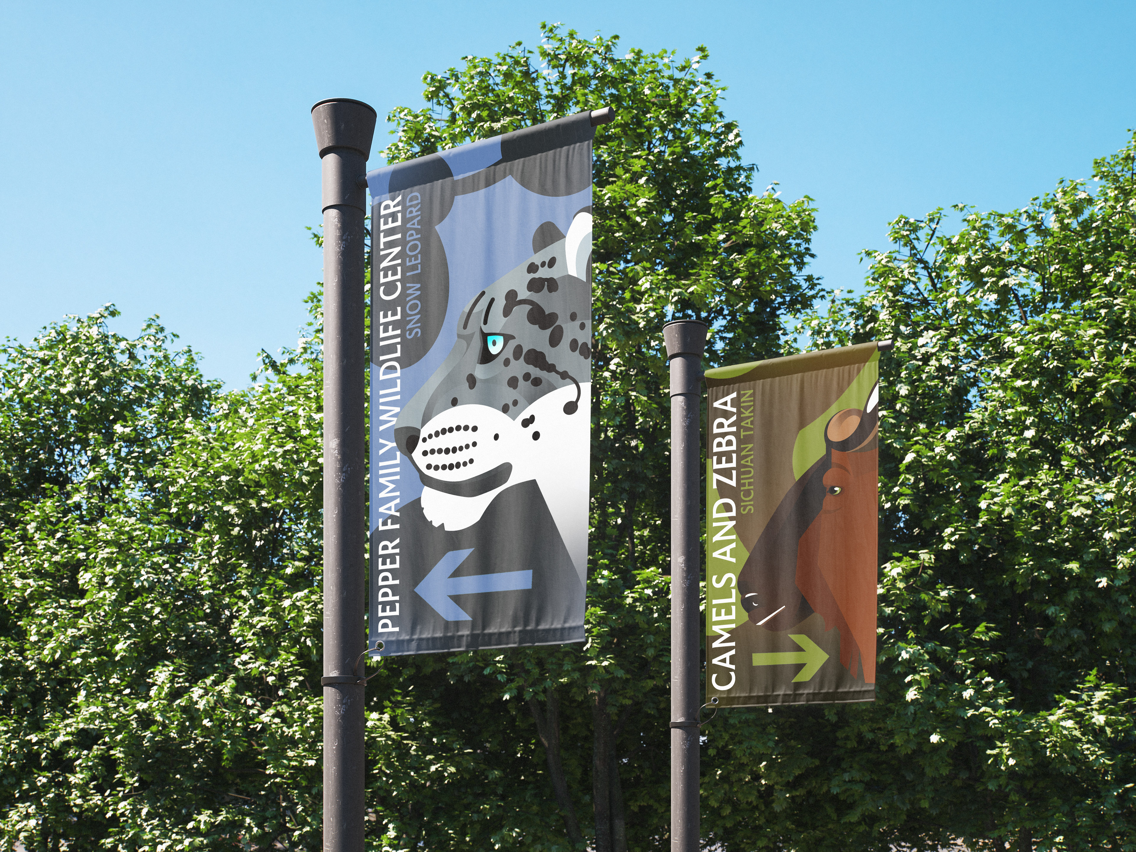
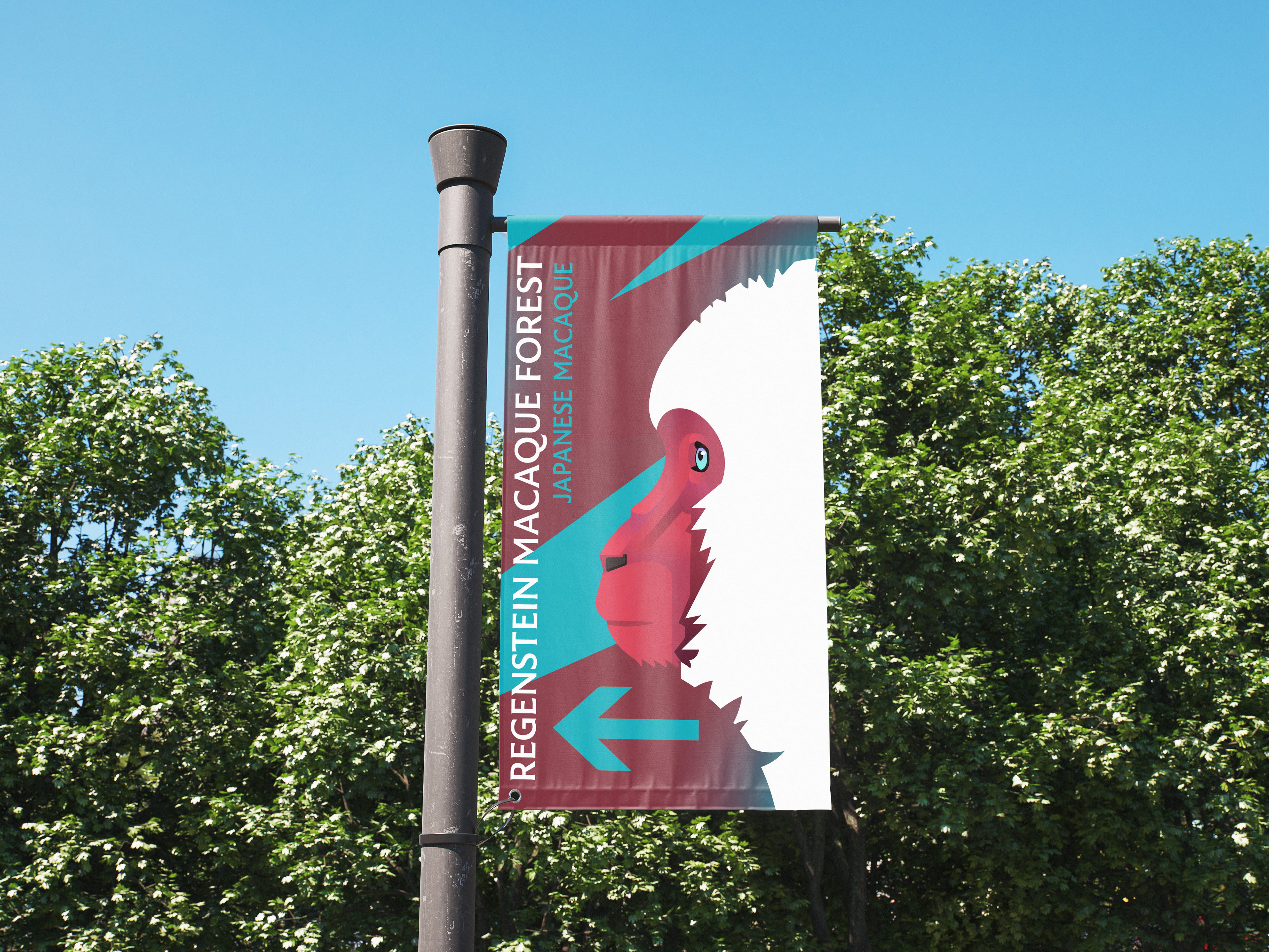
I was approached with the conceptual challenge of redesigning the logos and branding guidelines for Lincoln Park Zoo; the solution was geometric animal imagery with an emphasis on the authentic shape of the animals and colored gradients.
The idea stems from a more modern sensibility, where its sleek appearance resonates with the city crowds surrounding the zoo as well as providing the inference of the animal welfare being accustomed to modern tastes as well. The gradients will support the concept of a fun, bright atmosphere more catered towards children, their shape being complementary to the silhouette of the animal.
The shapes and geometry are not exaggerated, as to keep more mature audiences in mind; its found that many children’s activities and entertainment states an ideal of family friendly when, in essence, its more staged as “children only”. With this, the intent is to appeal to both the children or teens being taken to the zoo as well as the parents who are accompanying them, ensuring a positive experience for all audiences.